Showing posts with label usability. Show all posts

Saturday, March 26, 2016

Trying to be a Mac User--Decision to Give Up

In November I went all-in on switching from Linux to the Mac. Linux quality is ever-declining, and I had a laptop on which Linux Mint was almost completely unusable. But Mac usability is surprisingly poor, and I expect to return to Linux, mostly completely.

This is the first of a series of short articles on Mac usability deficiencies. From Wikipedia, https://en.wikipedia.org/wiki/Point_and_click#Fitts.27s_Law:

------------------------------------------

Fitts's Law

Fitts's law can be used to quantify the time required to perform a point-and-click action.
T = a + b \log_2 \Bigg(1+\frac{D}{W}\Bigg) where:

  • T is the average time taken to complete the movement.
  • a represents the start/stop time of the device and b stands for the inherent speed of the device. These constants can be determined experimentally by fitting a straight line to measured data.
  • D is the distance from the starting point to the center of the target.
  • W is the width of the target measured along the axis of motion. W can also be thought of as the allowed error tolerance in the final position, since the final point of the motion must fall within \pm\frac{W}{2} of the target's centre.
------------------------------------------

Why is this important? Regardless of where a window is on the screen, OS X places the menu in the far upper left. Mousing to the menu is more time-consuming than if the menu were attached to the window itself, putting OS X at a disadvantage compared to other popular desktop operating systems, especially those with large screens.

Tuesday, July 23, 2013

Scrollbars a page at a time, not a huge jump at a time

I've been really annoyed by Rhythmbox scrollbar behavior of late: when I click in the "trough" of the scrollbar, instead of moving the view by about a page up or down, it moves a distance corresponding to the point in the trough clicked. This is pretty bad for large text areas, such as a large music library. I complained to the Rhythmbox folks and Jonathan Matthew replied that this is default gtk behavior. This struck me as odd since I haven't noticed it in other applications, however Jonathan was right.

Google led me to a Gentoo site where ebichu was having the same issue, and posted the solution. I can't thank him there since I don't have a gentoo.org password, but he or she deserves thanks. The fix is to add a line to /etc/gtk-3.0/settings.ini:

[Settings] 
gtk-primary-button-warps-slider = false

So they apparently call this slider warping. Very user-hostile.

Thursday, January 3, 2013

Yet Another Annoying New Gmail "Feature"

In the past few days on a number of occasions I've been reading e-mail messages that ended abruptly. They ended at "[Message clipped]  View entire message." This adds steps to reading e-mail: noticing the truncation, clicking on it, and then closing the resulting new tab.

Not helpful. I still wish Google would hire someone with expertise in HCI, user interfaces, user experiences, etc., rather than stumbling along toward a higher entropy state. Their algorithms folks are great, but their UI folks truly suck.

Sunday, November 11, 2012

Why Ubuntu, Unity, Gnome 3, etc., Are Losing Popularity

Several times I've bemoaned the fact that Linux is getting more-and-more like Windows on a year-by-year basis. Of course, now, with Unity and its ilk, we're expected to use an interface that looks like a smart phone on a full-size monitor with an actual keyboard and mouse. Perplexing.

So it looks like I might try Cinnamon again since it appears that one can disable edge-tiling, which I  and apparently several other people find very annoying. The fact of the matter is that with a large monitor, wanting to maximize a window is a much less common operation than is moving a window, and edge-tiling badly violates the keep the common case fast principle. I often move windows to the top of the screen. With edge-tiling, this takes longer, since it is often followed immediately by an unmaximize operation.

Googling about this annoyance, I came across a discussion at http://ubuntuforums.org/showthread.php?t=1970815 which is a great example of inability to read coupled with arrogance. One of the posters complained that adding these sorts of features, making them default behavior, and not making it clear how to disable them wastes peoples time. Gerryl: This is dangerously close to operating with MS Windows. How are us mere mortals supposed to find out and address these kinds of issues?

The next posting agrees. I agreed (though without bothering to log in and say so). Then markbl responded


This is unfathomable. markbl knows better than gerryl what gerryl (and presumably me) will think it's a good idea once we get used to it? Maybe riding around in donkey carts would also start to seem like a good idea once one gets used to it. Maybe sitting in this pot of water that keeps getting warmer will someday seem like a good idea (wait, aren't we doing this is a society by continuing to pump carbon into the atmosphere?).

Furthermore, maybe it's been buried somewhere as an option, but once it suddenly becomes default behavior, or someone first encounters it when evaluating environments (as I did in Cinnamon), it's a new and potentially negative experience.

People acclimate to bad things, e.g., new user interfaces for Blogger and Gmail, but that doesn't mean we should be happy about it.

Wednesday, October 31, 2012

Jesus, Google!

Apparently someone at Google has decided that composing an e-mail is too straightforward, and so they've decided to muck with Gmail yet again. Zoho, anyone?

Thursday, October 25, 2012

Screenshots in Gnome, Mate, etc.

[ Note added 2013-05-13: I now have a scrot-based shell script that does this better IMHO than does Imagemagick. See http://martesmartes.blogspot.com/2013/05/screenshots-in-lxde-mate-etc.html ]

The Gnome screenshot tool has always fallen a bit short in the usability department. How do I change the default directory for storing screen shots? How do I make it default to "select area to grab"? I've always just lived with it, but tonight decided to do a little legwork to learn how to make it default to what I wanted, and I found something better.

 I've long used ImageMagick for image editing. In some respects Mirage is easier to use, but Mirage doesn't handle as many image formats. I suppose the GIMP is more popular, but it's a usability nightmare. Google led me to a wonderful page at the Webmaster Tips Blog.

Assuming one has ImageMagick installed, taking a screenshot of a selected area on the screen is as simple as typing

    import filename.imagetype

and then selecting the area of the screen to copy.

As a concrete example, suppose I want to capture some text from above in file selectArea.png:

    import selectArea.png

The result is this, in a file called selectArea.png:


I like it.

Sunday, September 16, 2012

Opera Address Bar Tip

There is a user interface design flaw in Opera 12.02 where, by default, the full URL of a web site is not shown. Here's an example:


Now suppose I want to select and paste this address, and click at the right edge of the displayed "URL." This is the result:


As can be easily seen in the image, if as user is not careful, a critical portion of the URL is lost. Even an attentive user still must repeat the select operation. Either way, time and effort are wasted.

Fortunately, though this is a bad UI decision, there is an option to force Opera to correctly display the URL correctly. Navigate to Opera|Settings|Advanced|Browsing. The penultimate checkbox under this tab is Show full web address in address field. Check this and the address bar will function correctly:


Similarly, Firefox no longer displays URLs correctly. The fix is here.

Friday, September 14, 2012

More Blackboard Dumbness

Blackboard is a badly-bloated course management tool that is mostly convenient for students, and mostly inconvenient for faculty. Periodically I point out problems with the tool. My most recent peeve is that posting an announcement, the instructor always must check a box saying that the announcement is available over the length of the course, rather than just temporarily. This is a failure on the part of a Blackboard "designer" to understand the basic principle. keep the common case fast. Par for the course.

A more amusing bug that I've noticed today is that if an instructor posts an HTML document that includes a commented-out link to an image, Blackboard prompts to upload the image. Dumb. Why interrogate the user about HTML source from a tool that is clearly incapable of parsing HTML source?

Sunday, July 8, 2012

Mate 1.2 Missing Crucial Scrollbar Functionality in Linux Mint 13

In Mate 1.2 on Linux Mint 13, the arrows at the tops and bottoms of scrollbars are sometimes present, and sometimes not. It seems to vary from application to application, suggesting it could simply be a bug rather than an egregious usability screw-up, but it is probably both. Having had similar problems with recent versions of Gnome, I figured someone had probably figured out how to fix this. Here's the trick (copy and paste as a single line):

sudo aptitude purge liboverlay-scrollbar-0.1-0 liboverlay-scrollbar-0.2-0 liboverlay-scrollbar3-0.2-0 overlay-scrollbar

Clearly overlay-scrollbar is screwed up. Oddly, this was removed from Linux Mint 12, but somehow snuck back into Linux Mint 13.

Thanks to MartinVW and LewRockwellFAN at http://forums.mate-desktop.org/viewtopic.php?f=2&t=113&p=1422

As an aside, it appears that this scrollbar crap is intentional. The following is from a posting elsewhere on "Ayatana scrollbars":

Overlay Scrollbar – The overlay scrollbar, or the Ayatana Scrollbar, is a feature designed to solve a non-existent problem. According to the official description, it was designed to “improve the user’s ability to focus on content and applications” and to “ensure that scrollbars take up no active screen real-estate” thereby “reducing the waste of space and distracting clutter that a traditional scrollbar entails.” That is pure nonsense. It just creates more problems than it solves. In fact, it does not solve any problem, because as stated earlier, there is no problem to solve, as far the scrollbar is concerned.

Aside from making you “look” for the scrollbar before you can use it, it creates an inconsistency in the system because some applications, like Firefox, will have the traditional scrollbar, while native Ubuntu applications will have the overlay scrollbar.

Wednesday, June 6, 2012

Monday, June 4, 2012

Libre Office Writer & Calc: Disabling Autoinput and Autocomplete

Some time back I wrote a quick how-to on disabling autoinput and autocomplete in Open Office. Libre Office 3 has the same problem: defaults that make the tools harder to use. The instructions there are still essentially correct but the wording on the menus has changed slightly, and I'm working with a fresh install, so I decided this is a good time for an update.

In Libre Office Writer click Tools|Autocorrect Options. Then select the Word Completion tab and uncheck Enable Word Completion. Also uncheck Collect Words, because there is no need to collect words for a feature that will never be used.

In Calc, click Tools and then Cell Contents, and uncheck AutoInput.

[ Note added 10 September 2012: above I should have written OpenOffice and LibreOffice as one word each, not two. Oh well. ]

Thursday, May 31, 2012

Why I'm Not Using Cinnamon

I was using Cinnamon on my desktops, and went back to Gnome classic no effects. This with Linux Mint 12.

I installed Linux Mint 13 RC on my laptop, and switched to Mate.

Mate works fine on my laptop. Mate keyboard shortcuts for volume up/down and play/pause do not work on my desktops.

So, why is switching to Cinnamon a bad idea, IMHO?
  • Cinnamon has no no grouping of menu items on the panel.
  • Bumping a window being dragged against the top panel causes it to maximize--a most annoying bug.
  • Nautilus 3.2.1 under Cinnamon shows selected files as pink with no text, or perhaps pink text on a pink background. Sometimes I like to be able to see the name of and related info for a selected file. Really. This is with the list view, which is my preferred default.
  • Under Cinnamon, ImageMagick's pan icon is missing window controls (e.g., close) which should be in the upper right.
  • [ Added 2012-06-02: Cinnamon removes the ability to move the save file dialog within a web browser. ]
I do like the hot corner, but it doesn't outweigh just the lack of grouping of menu items let alone the other problems I'm seeing with Cinnamon.

Saturday, May 19, 2012

Starting out in Cinnamon (w/Linux Mint 12)

[ Note added 2012-05-31: I no longer use Cinnamon. Here's why: http://martesmartes.blogspot.com/2012/05/why-im-not-using-cinnamon.html ]

I've been using Linux Mint 12 for awhile, and 11 briefly before that, ever since I got fed up with Gnome's decision that the user interface is unimportant.

Thursday a grad student asked me if I'd tried Cinnamon, which apparently he has liked on a few different platforms. This left me with a choice: work on the finals I would be delivering, or mess with Cinnamon. I chose Cinnamon, though I now must admit that my IS 247 exam suffered from insufficient proofreading.

I like Cinnamon, and recommended it to a friend, who didn't see much difference between it and what he had been running (probably Gnome Classic or Mate) on a Mint system.  I responded with a summary of my experiences with Cinnamon to date:

First, switching to Cinnamon on my recommendation should be worth some placebo effect. If not:

The panels are configurable, and it's okay to have just one.

TFM: the wrench & screwdriver  in the main menu leads to a different place from System Tools|System Settings wrench & screwdriver. If you select Menu|Wrench & Screwdriver, one of the options is Hot Corner. Make it visible, place it in a corner not otherwise critically used (it's translucent) and play with it.

I was using Gnome Classic with no effects, because with effects keyboard shortcuts didn't work. With Mate my volume controls (alt-up, alt-down) didn't work. This does everything Mate does without breaking keyboard shortcuts (big deal) and also allowing effects (not a big deal).

I really like Hot Corner.

Cinnamon has more themes than Gnome Classic, but still not one I really like. A little googling, though, led me to a page on creating themes, and it does look simple, except I'll be editing CSS and am unclear regarding what some of the tags are. I'll either find docs or experiment.

What I really want are larger fonts in the panel and top bars on windows that change colors noticeably between selected and not selected.

There is one clear-cut bug that I've seen: Under Cinnamon, Gnome Terminal 3.0.1 doesn't consistently switch its cursor to solid block (from outline) when the window has focus. A minor aggravation.

I have an old (ca. 12/2005) Dell laptop running Ubuntu 10.4 LTS. Ubuntu's LTS is rather short, and has expired, so I think I'll blow that away in favor of the Mint13 RC, Cinnamon, and Mate. If Mate is less buggy in the Mint 13 environment than Mint 12 (they use the word mature to describe it, but I have yet to see evidence of that) it might be a good choice. Anyhow, the new Mint 13, Cinnamon, and Mate on modest hardware seems worth learning about.
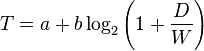
Sunday, May 13, 2012

Chrome Cookie Management: Could be Better

I went into my Chrome settings this morning to delete unwanted cookies. Clearly I had waited too long, and should have simply deleted them all and then dealt with the consequences later. Instead, I went through many, many cookies individually and deleted the vast majority of them. Some thoughts:
  1. It would be nice to have a select-all control with the ability to then go through and uncheck a few.
  2. Why is the server address limited to such a narrow field? Even when I maximized the window, the server address field stayed narrow, and there was no adjustment gadget to make it wider. Thus many of the server names were not fully-visible.
  3. From now on I do more of my browsing in an in cognito window, or in Opera. I use Opera for various news-related sites and blogs that I visit daily, and my Opera settings are to delete all cookies on exit.

Thursday, May 10, 2012

NTP in Linux Mint 12

It appears my Mint system is using NTP, but the reason I'm even thinking of this is that my system clock seems to be drifting.

The Mint User's Guide (still Mint 11 at the main site) has no mention of NTP, nor of "Network Time," the vague label used in the Date and Time settings. Dumbing down the interface by labeling what I suspect is NTP as "Network Time" is not helpful, especially if it's not documented. Someone who understands networking is left wondering if this is NTP. Someone who doesn't understand networking will have no clue what the "Network Time" switch is for:


Now I have to dig into the configuration files if it turns out I care enough.

Friday, April 27, 2012

Gmail Button Labels

Gmail has a "feature" that allows one to change the obscure button pictographs back to readable labels, and sometimes it even works. In Firefox I find myself having to refresh pages to get the labels to show instead of the execrable pictographs. I don't want to have to refresh just to know which frigging button archives a message.

Thursday, April 26, 2012

New Gmail Stinks Maximally

First impression after spending ten minutes looking for a way to revert back to the much more usable older interface was where's my calendar gadget. My next impression is that I just replied to an e-mail, and there's no god-damned archive button.

I'm sure one of those obscure pictographs will perform the archive function, but doesn't Google have a single software engineer who has spent even a minute thinking about usability??

Friday, April 20, 2012

Google F'ing With Blogger Again

Google, over the last several months never hesitating to replace a decent user interface with a bad one, is again F'ing with the blogger interface. Lovely (not). Why the rush away from usability?

Friday, December 9, 2011

Adiós Ubuntu, Hola Linux Mint 12

Today I got rid of my penultimate Ubuntu installation--Ubuntu completely abandoned usability and customization in favor of perceived glitz. I do, however, still have an old Dell laptop (bought at the end of 2005) running Ubuntu 10.4. Support for that drops in April, so some time around then I will likely do a fresh Mint install (and maybe insert a larger hard drive). For now I'm leaving well enough alone. I've thought about replacing this machine, but don't really need to, and so now I'm going to nurse as many years out of it as my primary portable as I can.

I have a Samsung netbook with 1MB RAM; it was running XP, but now it's Mint 12/Mate dual boot with XP. I plan to use it to play around with OpenBox. Also, it's getting a little old, was never expensive to begin with, and has  no files to speak of, so I feel comfortable travelling internationally with it and occasionally leaving it momentarily unattended in a classroom.

My main desktop at home is running Mint 11. This was because the machine would not automatically hibernate with Ubuntu 11.04, so I "upgraded" to Ubuntu 11.10, had a terrible experience--Ubuntu offers a number of user interfaces with 11.10, all of them bad. So, in time I performed what turned out to be an actual an upgrade, to Mint 11. This was amazingly trouble-free and very easy to configure--Mint made a great first impression on me. I'll probably upgrade this to Mint 12 sometime after finals.

My desktop at work would not wake up from hibernate with Ubuntu 11.04 (sense a familiar theme?), so I "upgraded" that to Ubuntu 11.10, hated Unity, hated Gnome 3, and lived with XFCE for a few weeks. XFCE is really clunky and, with Ubuntu 11.10, even with XFCE and as much junk as possible disabled and uninstalled, was very, very slow. This may have been an Ubuntu issue, or an XFCE issue. No matter; as of this afternoon the machine is running Mint 12 with Mate, and seems to be performing fine. The university gave me this machine in '06, and it has just 2GB RAM and is dual core, which seemed sweet then, but pedestrian now. Still, it should be plenty for software development and document typesetting. Anyhow, with Mate and Mint 12, things seem okay.

I'm in the process of removing a bunch of garbage as both Mint and Ubuntu seem to have this philosophy that bloat is good. I'll detail that later. Of course I have to install a lot of stuff as well, which I have started with tcsh, emacs, LaTeX, and GHC being first. Then Google Chrome, which wasn't as easy as I'd hoped. Details soon.

Monday, December 5, 2011

Gmail's New Interface: Stupider than I Originally Thought

As bad as I originally thought Gmail's new interface is, it's worse. They have hidden the 'choose font' button behind a T. Sure, T stands for font. I get it. This is what it looks like:

The T between the underline and the font size selector is for choosing font. Blogger, and every other GUI I use, uses a stylized F for font. Perhaps Google thinks it's powerful enough to change the word from 'font' to 'tont.'

This is just more evidence that Google's new interfaces for Docs, Gmail, etc., are not well thought-out and are simply change for the sake of change. Overall, replacing words with obscure pictographs and then using letters that have no apparent relation to their function are slaps in the faces the user community.